

Squiggle
End to end design for a mobile note taking app.

-
My Role
End to end UX/UI Designer and Researcher
-
Timeline
80 hrs
-
Tools
Figma, Miro, Whimsical
-
Prototype
Overview
I designed a mobile app called Squiggle a fun way for people to organize and jot down notes in their day-to-day life.

Background
It was a Wednesday- an average mid-week day and I was preparing to go shopping. I pulled out my phone and started typing a list up so I wouldn’t forget that we needed dishwasher pods, paper towels, and some other miscellaneous household items. I appreciated my native android notes app, but it was so drab and I wished I could add more pizzaz to it… Flash forward to getting ready for a trip to Puerto Rico and I ran into another gripe, adding images of my itinerary to my note was clunky. Simply put it looked like a jumbled mess.
This is how Squiggle was born, a note taking app that has just as much flare as simplicity, while still offering big ticket features that make your note taking experience more streamlined and pleasurable. Squiggle has fun customizable options similar to your favorite journal and pen, but available on your phone.
The Problem
Although there are an influx of note apps, they all miss key opportunities to customize the interface while still providing highly desirable and accessible features.
People like to take notes and stay organized, but they want a simple solution. Native note apps provide simplicity while other apps like Notion and Evernote provide a huge bundle of features but lack simplicity. On top of that the note apps that are available have a very sterile feel to them. The average user doesn’t take the time to successfully learn how to use these apps, but they still want to take advantage of key features like templates, password protection, and reminders.
The Solution
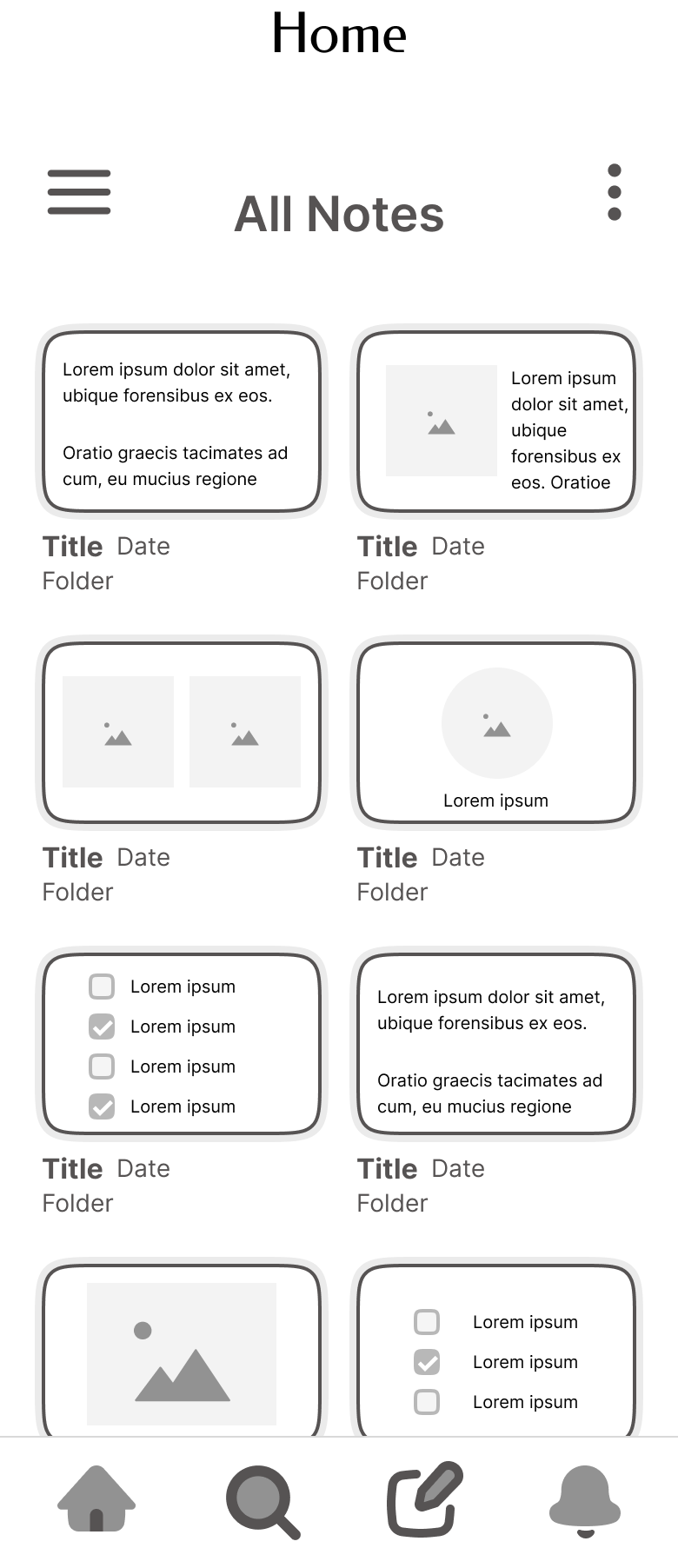
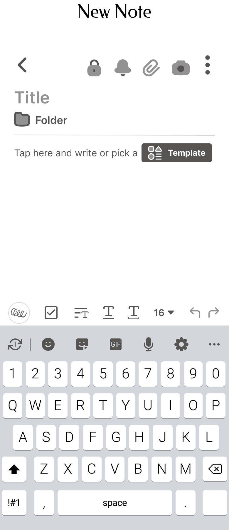
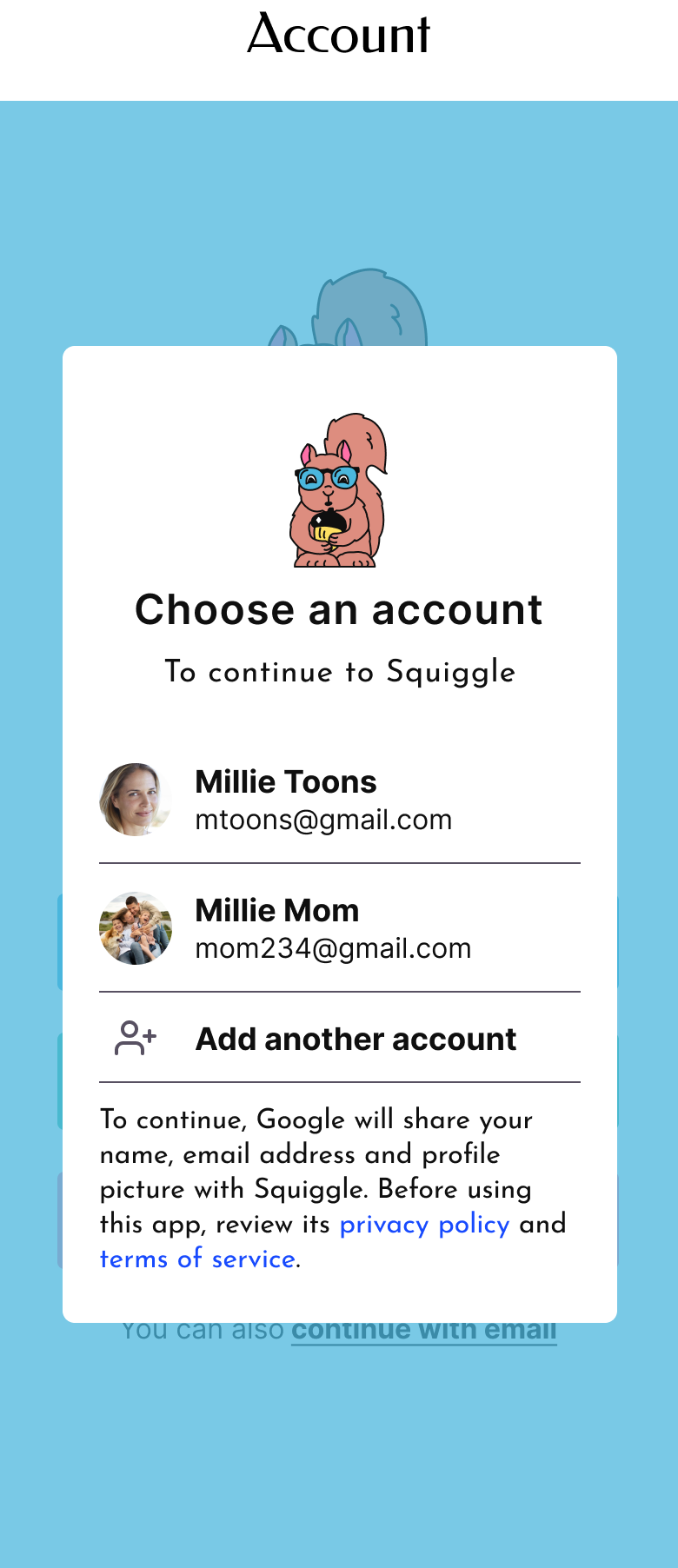
I created an end-to-end app for users to create and customize notes all available in one quick and easy to use platform.
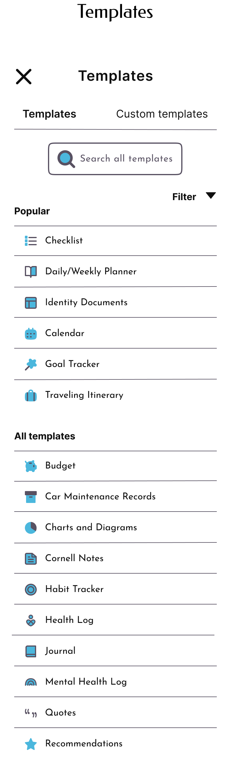
The Squiggle app consolidates these key note taking features:
Choose from available templates or customize your own
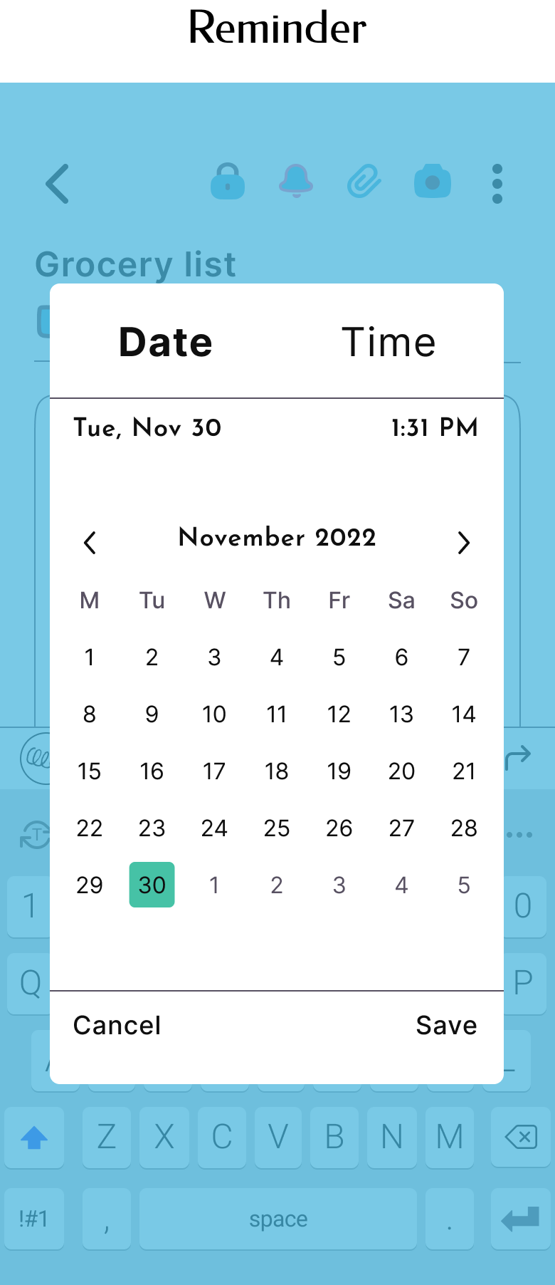
Password protect individual notes
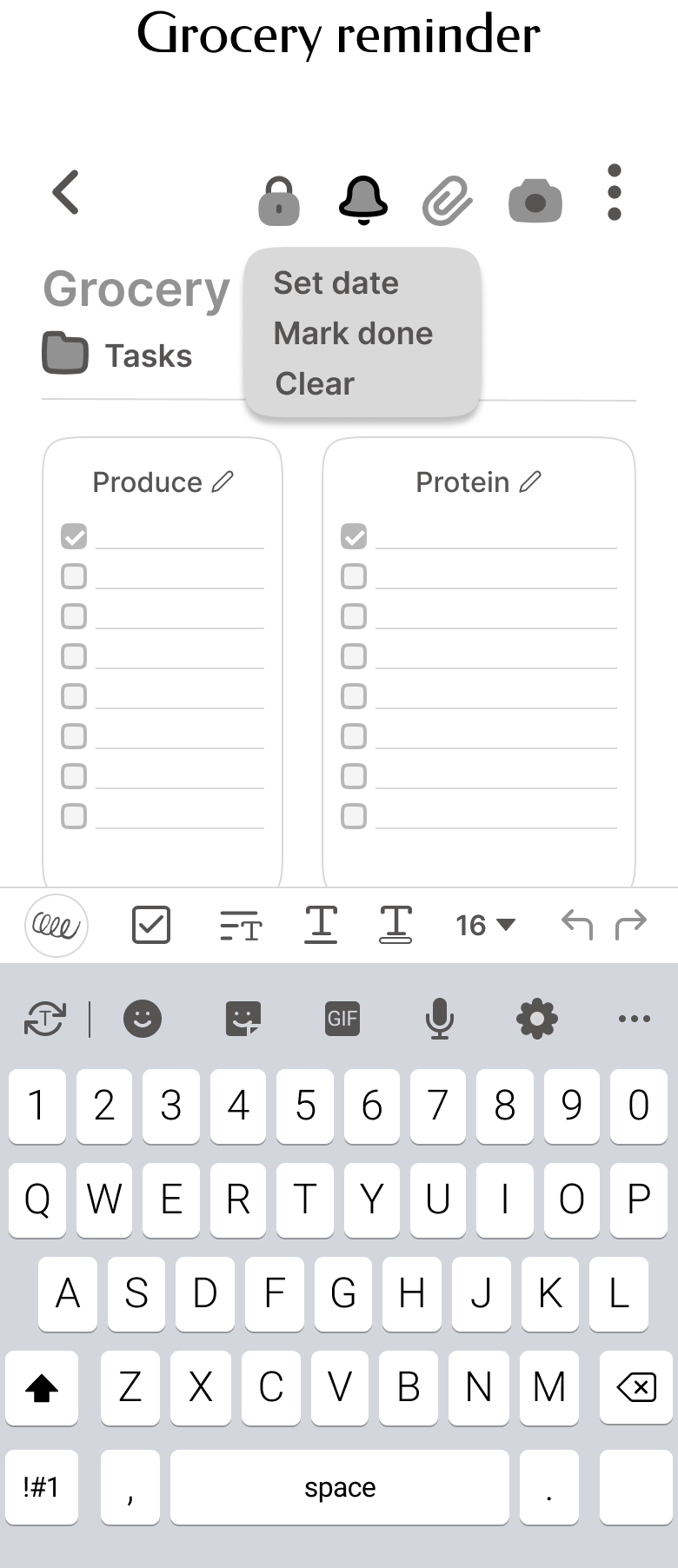
Add reminders to individual notes
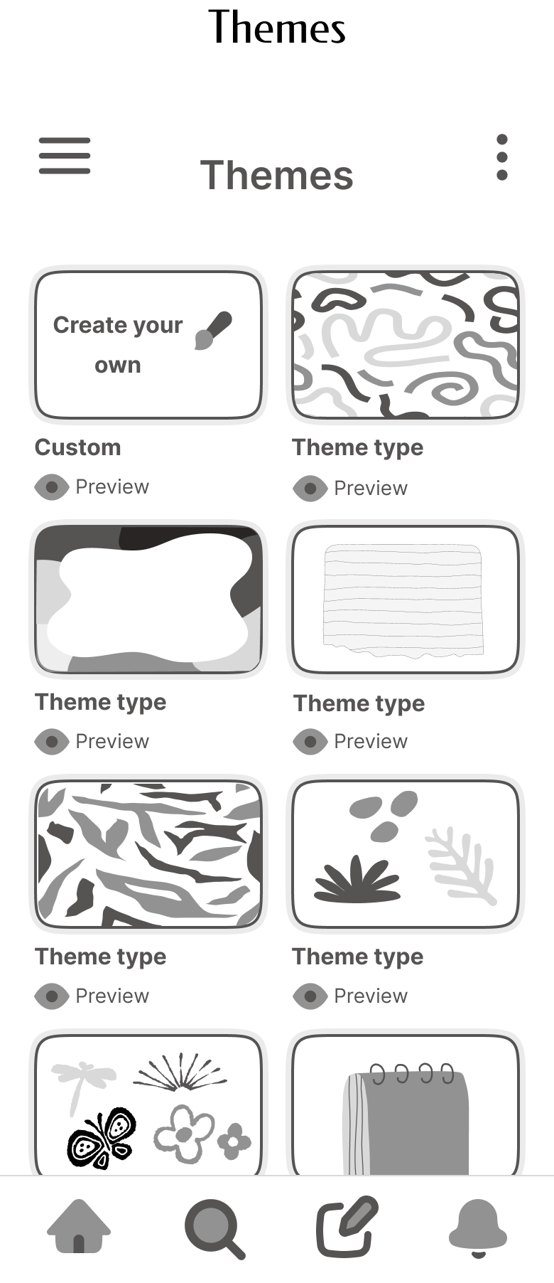
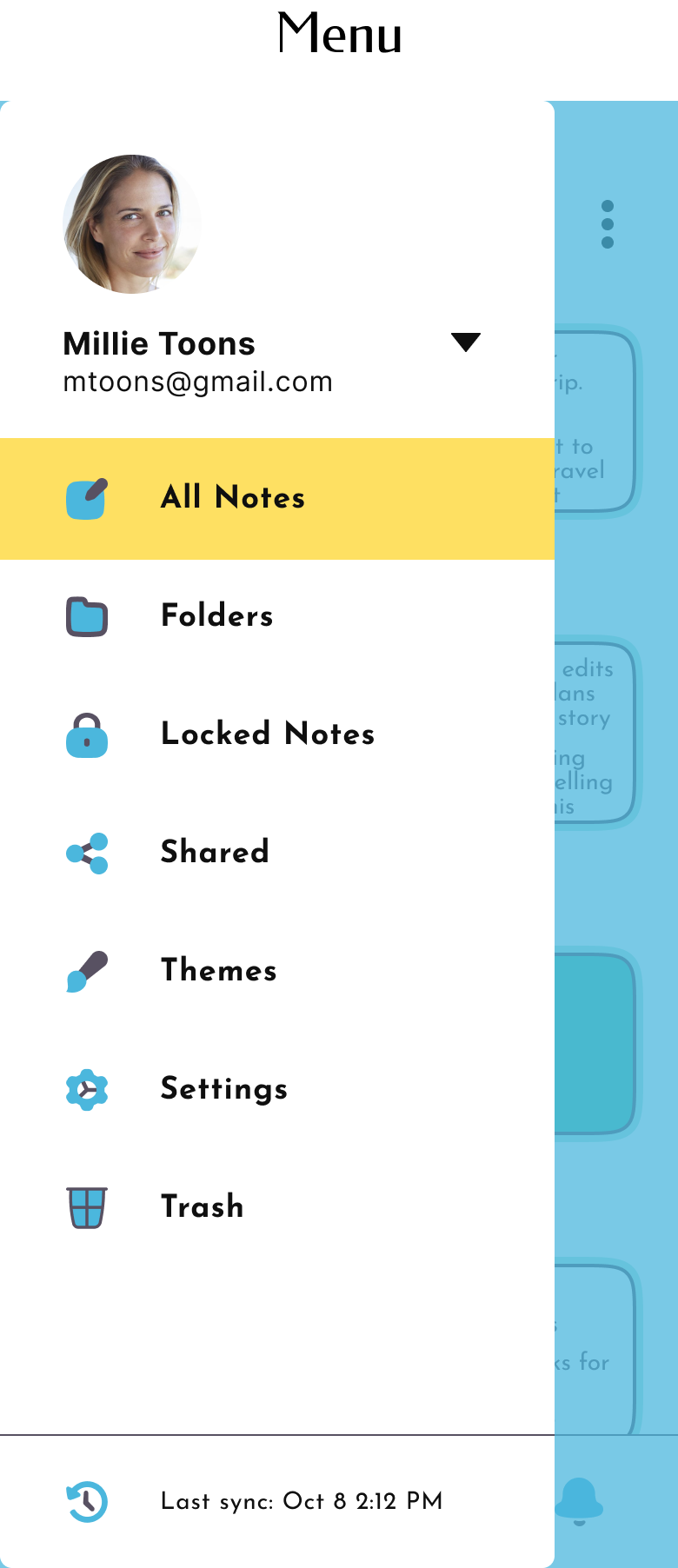
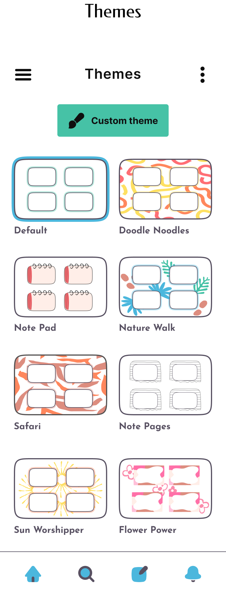
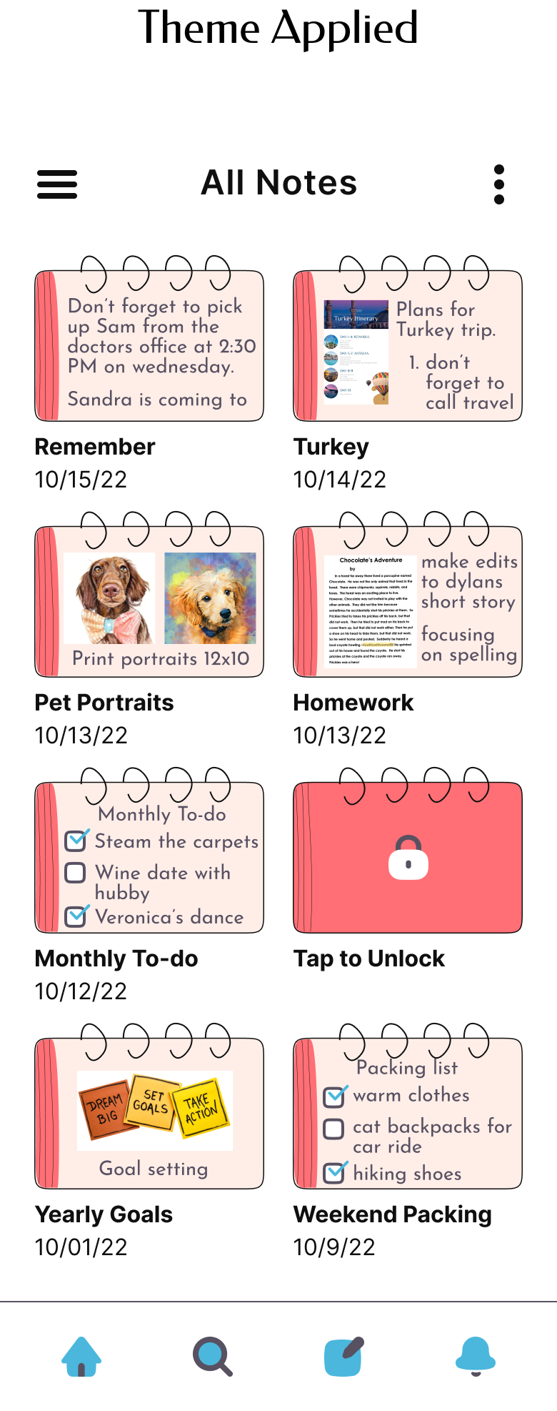
Set a theme for the app interface or customize your own
Research
Goals
I started this project with the goal to understand more about note taking behaviors, strategies, and stressors. I wanted to know:
What are the pain points in taking digital notes?
What motivates users to take notes digitally and on paper?
What are the top note apps?
What do users like about these apps?
What don’t they like?
What are typical note taking styles and preferences?
Competitor Analysis
There are numerous note apps on the market and many cater to students or users in the workforce. I did a competitive analysis on some of the top apps in the app store and identified common features.
The app that stood out was Evernote, I eventually did some additional research and also came across Notion. Evernote and Notion both offer templates and password protection in some way though their UI on mobile was less visually appealing and simplistic than native note apps.
Here is what I found:
Native note apps do not include reminders
Templates are only available on a few note apps
Password protecting individual notes are a rarity, in fact only 1 app offered this feature
No note apps offered the option to customize themes

User Interviews
User interviews were conducted in-person with 3 participants. Since note takers are so widespread I didn’t do any initial screening surveys. These were exploratory interviews to gauge common note taking habits.
Question Examples
Tell me about the most used app on your phone
Tell me about the top organizational apps on your phone
Tell me what type of notes you take
Tell me your go-to for jotting down notes and ideas
Key Findings
The insights from my interviews confirmed that the top expectations for an organization app include; sync notes across devices, simplicity, visually appealing, secure, checklists, and reminders.

Empathize
User Personas
After conducting interviews, I had many note-taker archetypes in mind but I was on an 80 hour deadline so I limited myself to two personas with varying needs.
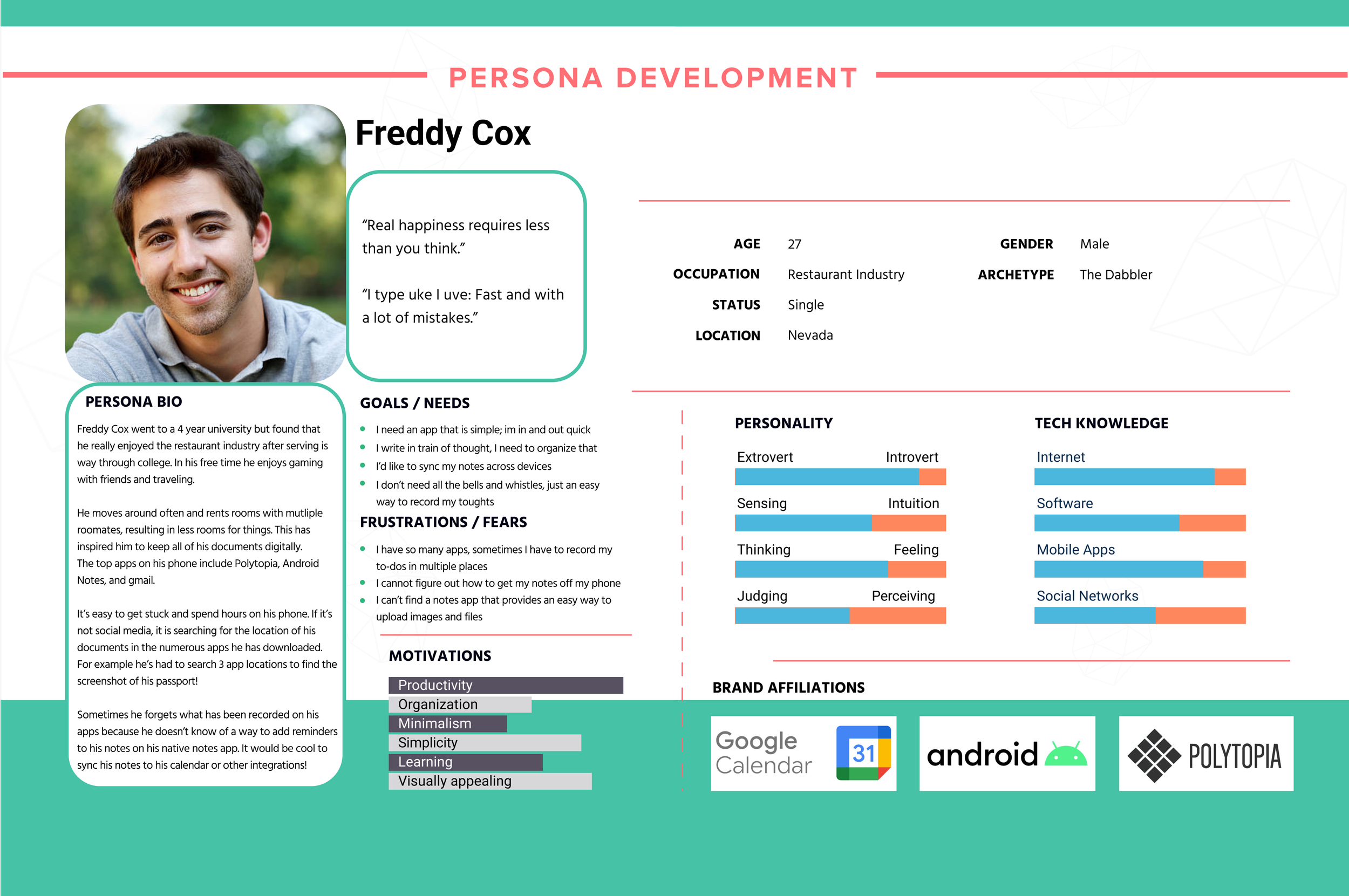
Freddy
Freddy is a casual note-taker, but has made effort to organize his documents and thoughts digitally since he moves around a lot. He needs help organizing his thoughts as they typically are pretty messy, though he is a simply guy and doesn’t need all the bells and whistles some apps have. He also does not like paying for apps and finds it frustrating uploading photos and documents to his current note taking app.
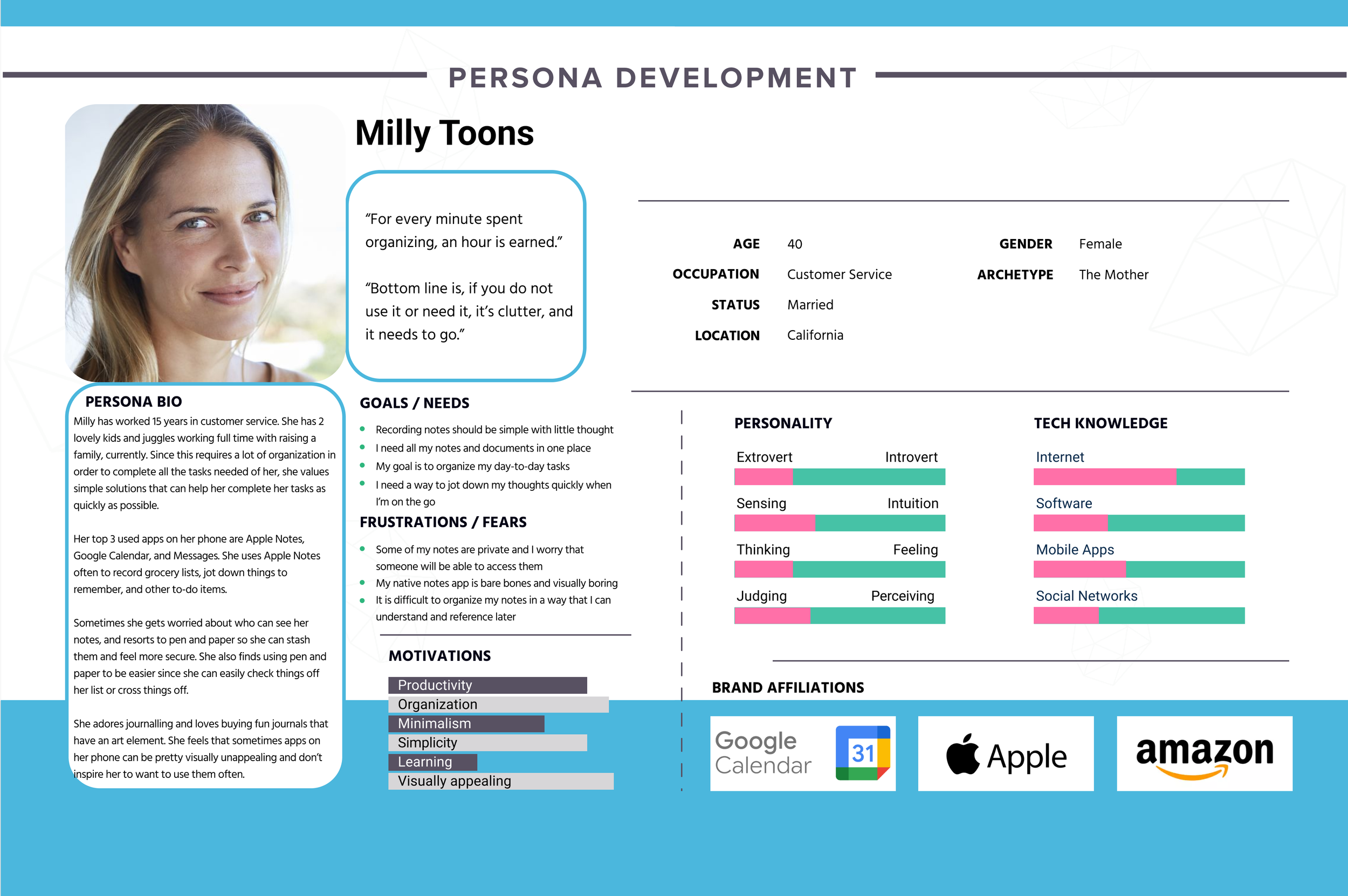
Milly
Milly is a busy mom and is extremely organized so she can stay on top of her to-do list. She enjoys fun and quirky journals and nick-nacks, though she does think of herself as a bit of a minimalist. She finds her current note taking app easy to use but visually boring and lacking password protection. She also has no idea how to make checklists or add reminders to her notes.
Designing with a fresh perspective
With the user personas and research findings completed, I reviewed the project goals and summarized highly desirable features and expectations for a note taking app.
Feature Roadmap
I created a feature roadmap to summarize what needed to be included on the app and based them on priority.
My primary goals for creating and organizing features:
Offer expected features that users already see and appreciate on similar note apps
Make user flows simple requiring minimal or no learning
Have fun!!
Card Sort
I chose to do a closed card sort to see what template options participants would find most important, somewhat important, and not important.
I also included another category "What is this" to get a better idea on how my wording for these templates resonated with the users.
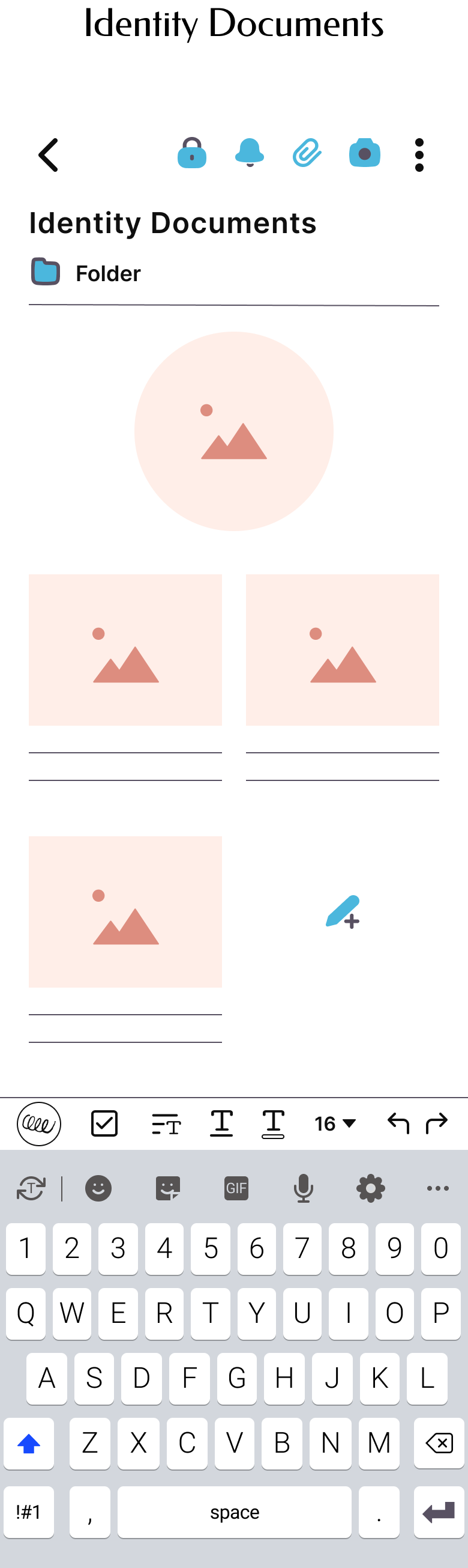
Since this is an 80 hour challenge, I only focused on the templates that were the most useful. These included: Checklists, Daily +Weekly Planners, Identity Documents, Calendar, Goal Tracker, Journal, and Travel Itinerary.
Define
Consolidate my findings
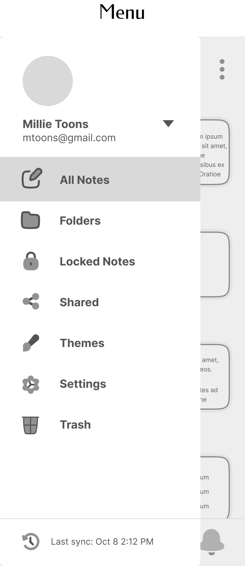
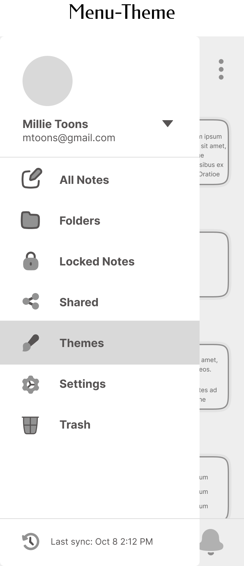
After gaining clarity through empathizing with users, I was able to create a site map that had a simple structure and helped in streamlining the design process.
This process helped me to visualize where content would live within the app.

Task Flow
My research participants were clear that while they saw value in using templates and further customizations, they did not want to over complicate it.
I created two task flows:
Selecting a template for new note and adding a reminder
Applying a theme to the app interface
User Flow
To further solidify the thought process of a user, I created a User Flow. I wanted to include multiple template options and both reminders and password protection in this user journey.
I based this flow around my user persona Milly.
Select a template and add a reminder
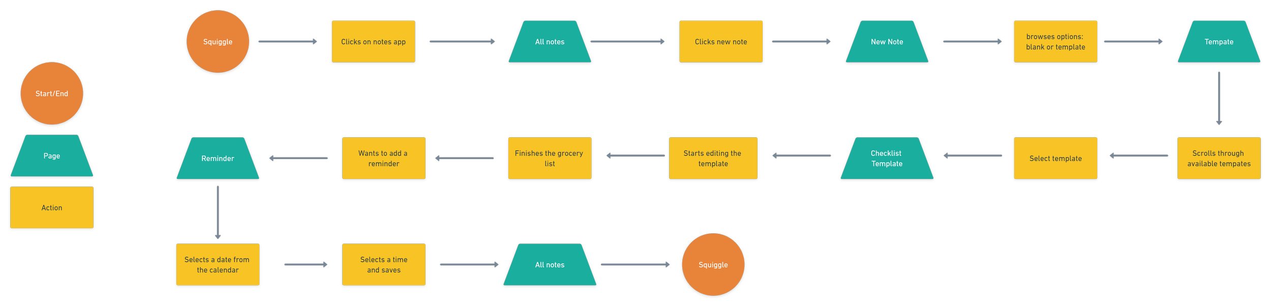
Apply a theme to the app interface

User Flow

Ideate
Brainstorm
I brainstormed potential solutions using 3 questions as my guide:
1.
How will Squiggle help users organize notes and easily implement templates?
2.
How will Squiggle include key features like reminders and password protection in an intuitive way?
3.
How will Squiggle offer accessible theme options to make note taking more fun?
Lo Fi Sketches
Based on what was accomplished in the Empathize and Define phases I started off with some lo fi sketches to brainstorm the app since this would be a low committing way to explore my ideas.
I did extensive research on app competitors to get clear on standard flows like starting a new note and navigate to locations like menu and home.

Wireframes
With my sketches in tow, I had some additional time to research fun ways to surprise and delight my users. I was especially interested in exploring animated loading signs, as I felt that was a unique and fun way to catch the attention of a user immediately when they open the app. Since there are already so many note apps on the market, it was really important to create unique distinguishers for Squiggle.
I created hi-fidelity wireframes because I had a pretty good idea on how I wanted everything to look after the sketches. I used a lot of stock images for the templates and themes, though I knew I wanted to create custom icons during the branding process.
Hi Fidelity Wireframes
You can also swipe on mobile or click and swipe on desktop to view!


Branding
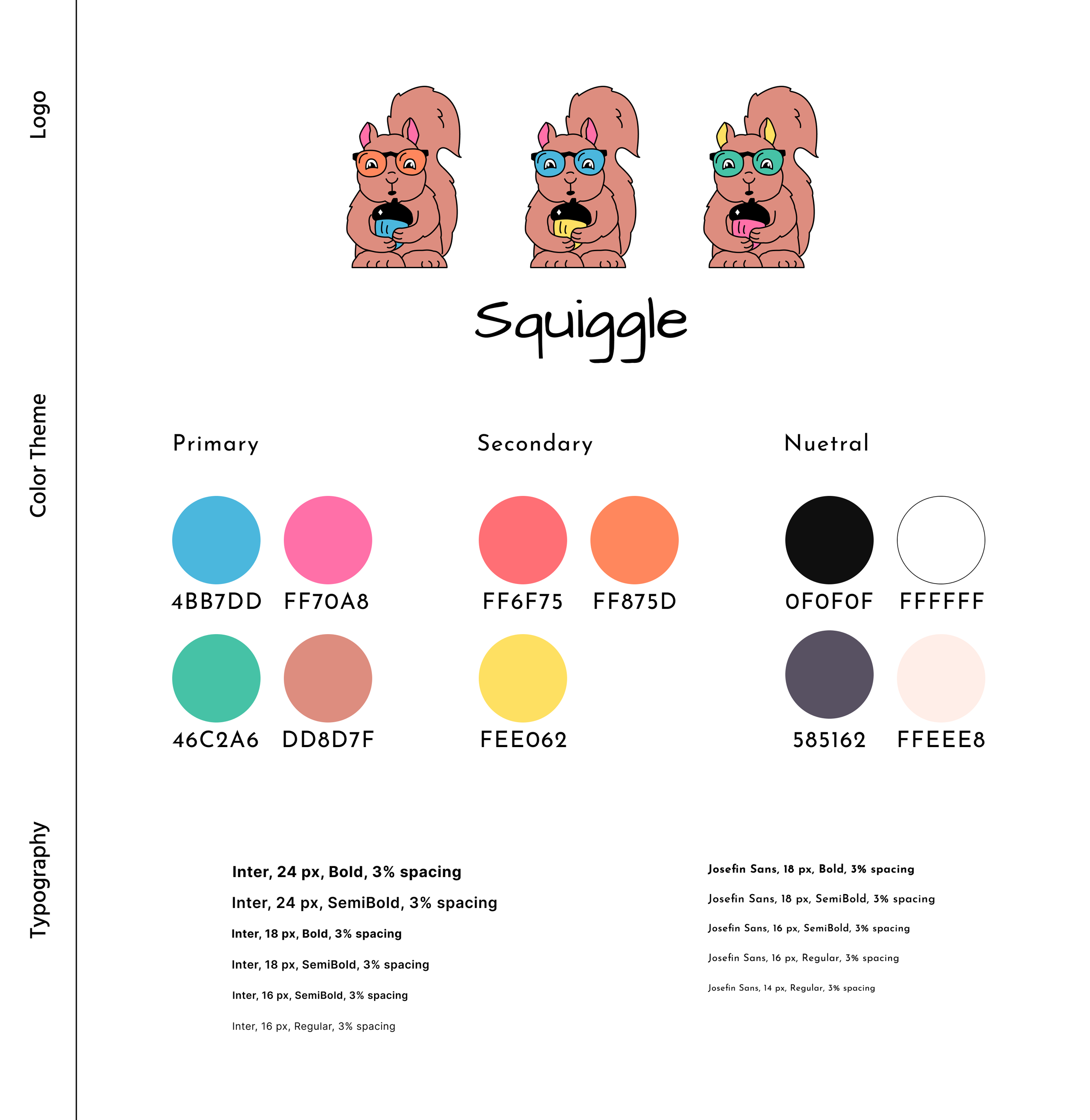
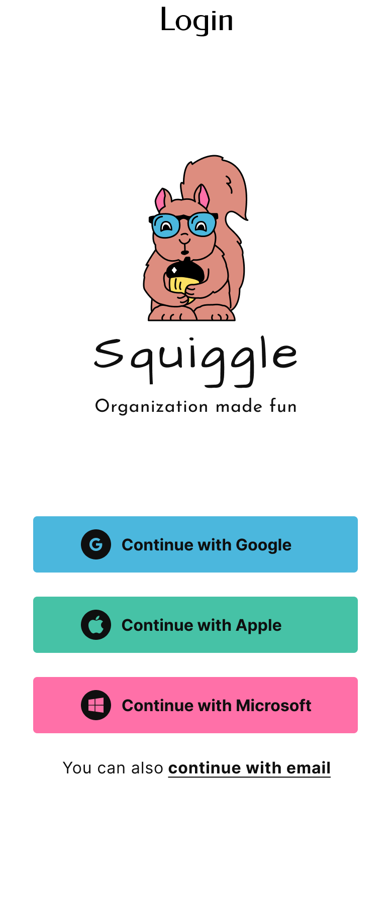
I wanted to create a friendly squirrel logo because squirrels are notoriously very great organizers when it comes to their food source-nuts.
To go even deeper into that reasoning, a study was done at UC Berkeley that claims tree squirrels use a mnemonic technique called "spatial chunking" to sort out and bury their nut scores by size, type, and perhaps nutritional value and taste. When they are hungry later, it is theorized, they can remember where to find what they want.
I was inspired to create playful and cartoonish drawings, when I found during the research portion, many participants had fond memories of journaling as a child or teenager. I paired that playfulness with modern icon designs to create balance.
For color, I was inspired by common highlighters and color pencils. I did a lot of research with popular accessible color tools to find the line between staying true to these commonly accepted colors while still creating an accessible app.
To come up with a name for my app I jotted down words, phrases and feelings related to the apps functions- note taking. A lot of apps were so serious and “on the nose” with their name, so I wanted to “think outside the box”.

Visual Design
Putting everything together
I applied the branding and UI elements to the wireframes and continued to refine my designs after a round of feedback from peers and my mentor. Here were the main changes I made from wireframes to visual design:
1.
I updated the Themes page removing the “preview” eye icon since it looked a bit cluttered. Instead I chose to have a “default” block so that users can switch between themes and still choose the default option if they’d like.
I also chose to add a “custom theme” button to match the “custom templates” button, and create a new “All Notes” page with a theme applied.
2.
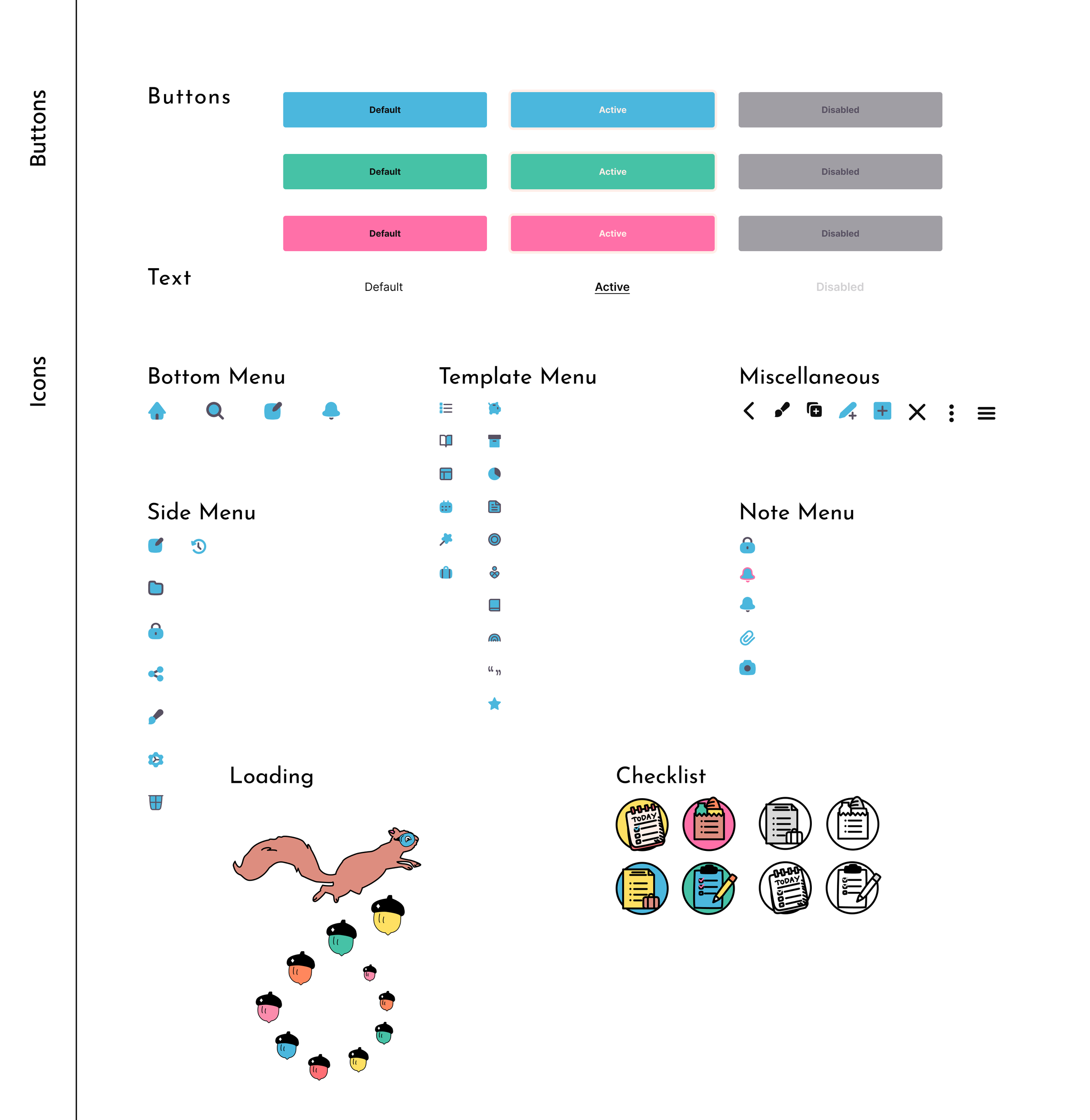
I resized all of my icons to ensure that they were uniform, utilizing components to make sure they were all divisible by 4pt.
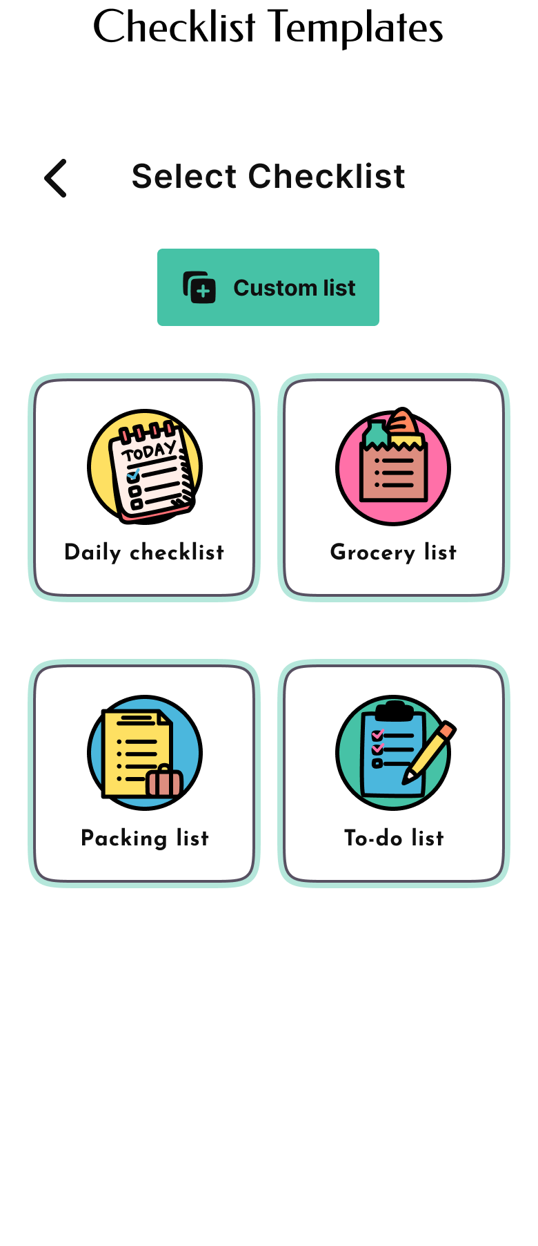
During this process, I also created custom Icons for all of my pages. The most notable icons are the “Select Checklist” icons.
3.
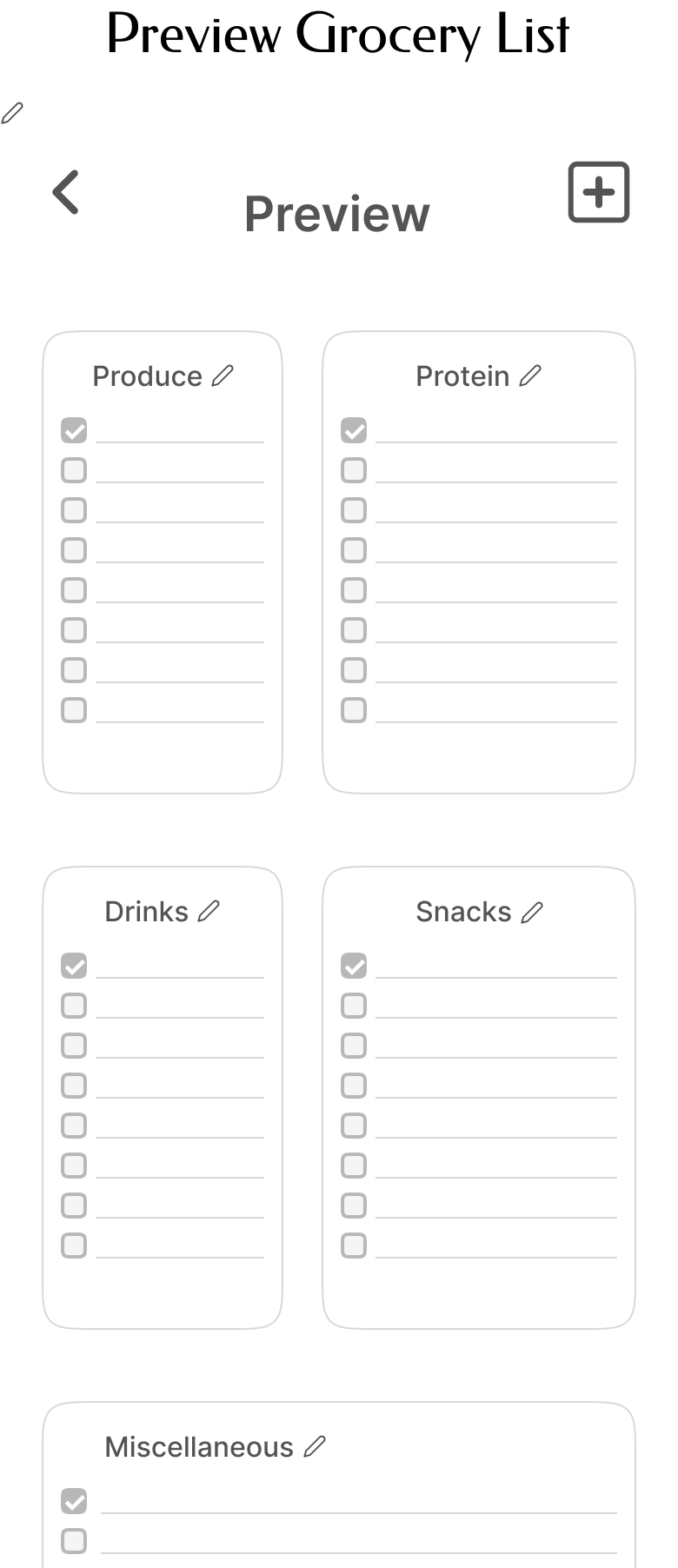
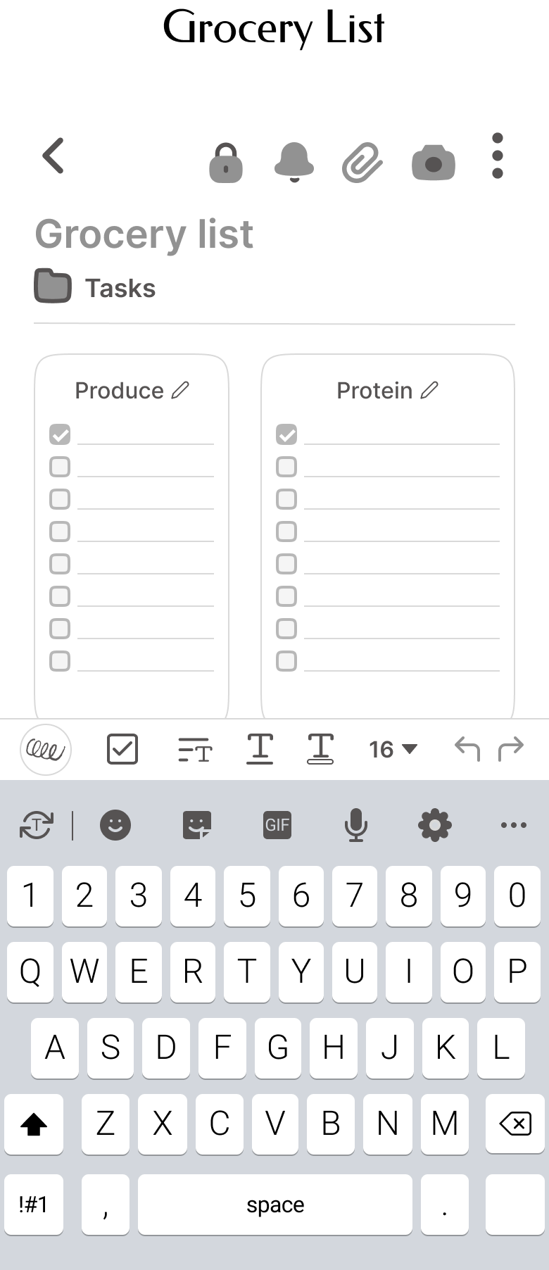
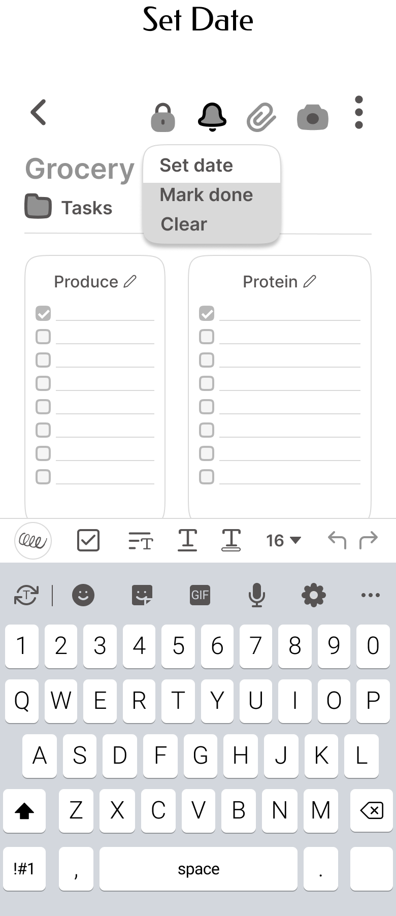
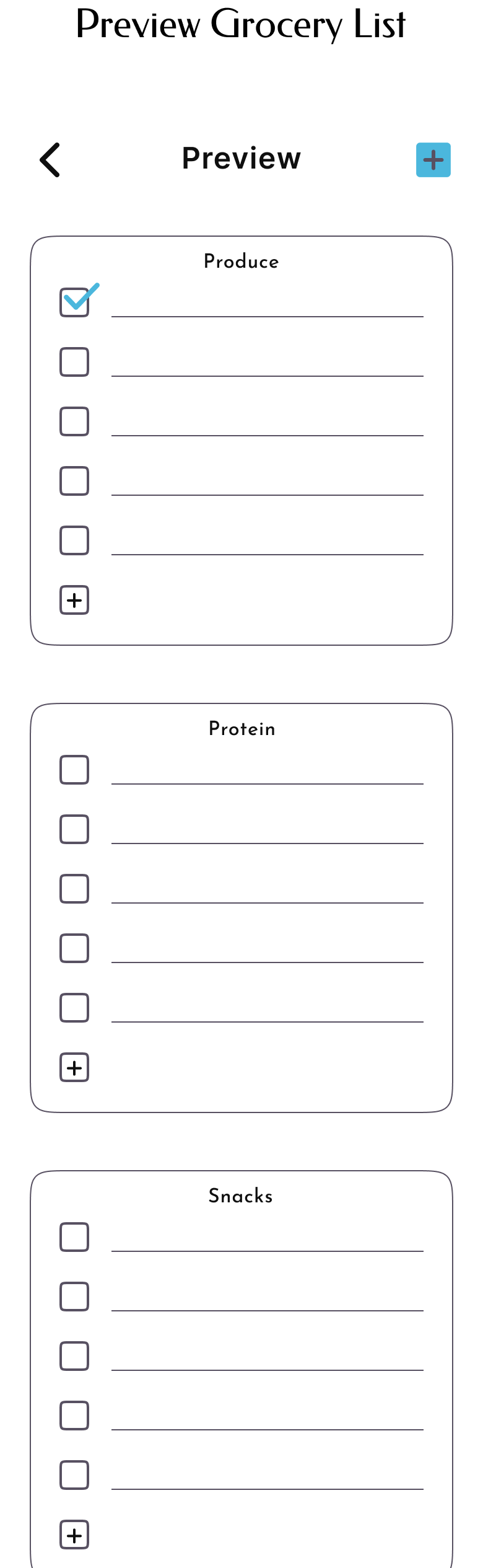
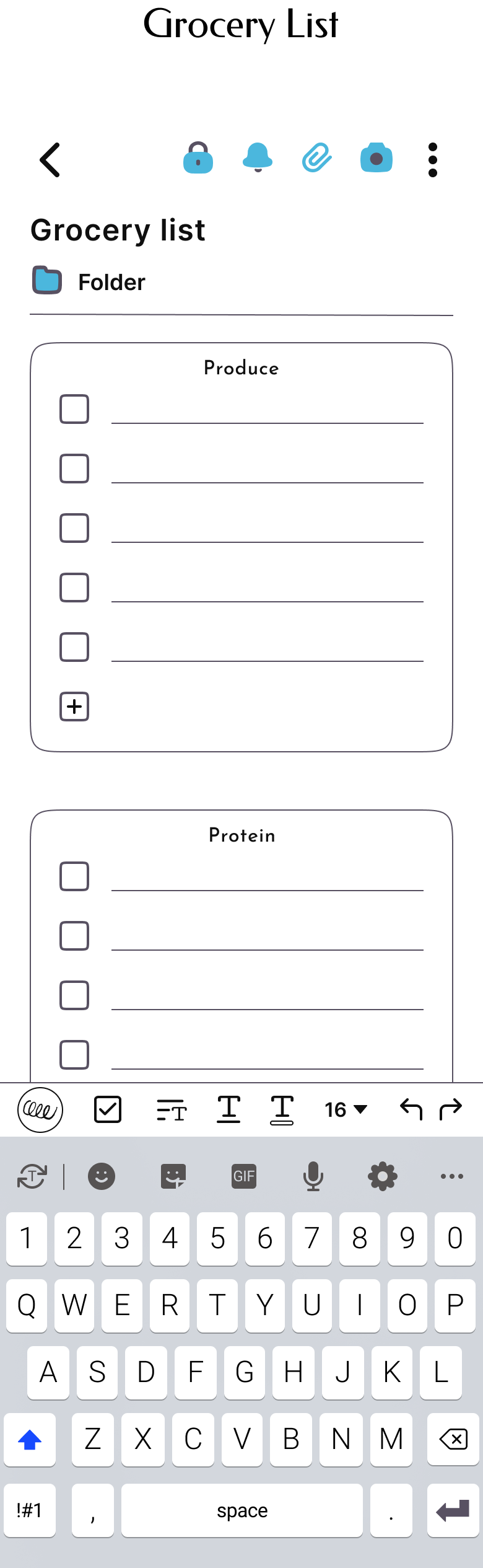
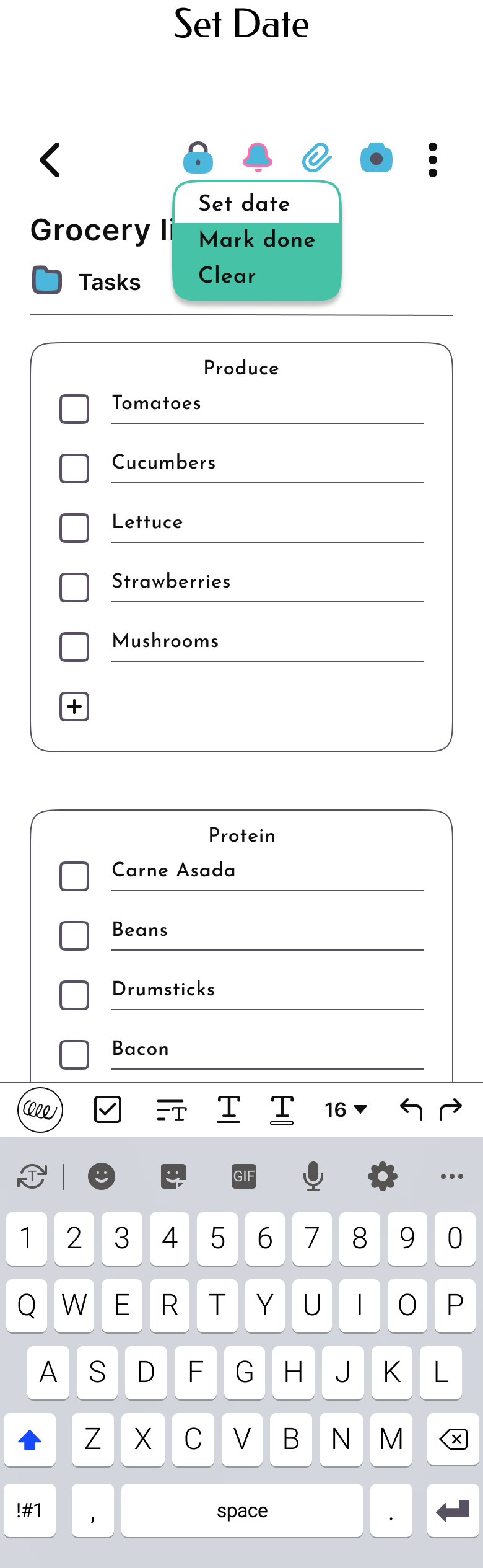
The Grocery Checklist was very compact and the checked boxes were too small for usability.
I ended up removing the two side-by-side sections and stacking one section on top of each other so I could make the checked boxes bigger. This helped to reduce clutter.

Visual Design
You can also swipe on mobile or click and swipe on desktop to view!


Animation
I wanted to create a fun and unique way to catch the attention of a user first interacting with the app.
To remain true to the branding, I chose to make a custom loading sign utilizing my original squirrel logo in running form. For the loading bar, I created a spiral out of colorful pine-nuts!
Test & Iterations
Usability Testing
I conducted a moderated usability test with 3 note takers to identify design problems and test the concept. I also had an informal feedback session with a group of UX design students to uncover any trends. The participants and students said they appreciated the fun visual design elements and felt that creating a note with a template seemed a lot simpler than other apps. Squiggle was an app they could see themselves using and customizing.
Insights
-
Overall users were delighted with the animation to enter the app. The visual design brought them a lot of joy and 100% of participants could complete all flows.
“Note apps are usually so boring but this one is so fun!”
“Applying themes is genius!”
-
For the most part there were not many pain points to note. Recurring feedback included suggestions to add a preview element for applying a theme.
50% of participants questioned how themes would look once applied.
-
The main suggestions from testing included adding a preview for themes and also 25% of participants noted that there was a lot of text on the “All Notes” page.
Affinity Map

Priority Revisions
Based on the feedback from testing here is what I focused on and revised:
I added a preview to the themes flow so that users would understand how enabling a theme looks.
I decreased clutter on the “All Notes” page to reduce eye fatigue and make it an overall more pleasant experience.
Reflection
Conclusion
I created an app that helps note takers of all experience levels organize their thoughts digitally. When I look back at this process, Squiggle resolves the primary pain points and frustrations articulated by so many of my research participants.
Learning
I started this project wanting to invent something new, but after initial research I found the features that inspired me (templates and password protection) wouldn’t actually be new on the market. At first I was not sure how to digest this information, but throughout the research and design phase I learned you don’t always need to invent something new to design something great.
Coming to terms with this and taking each new chapter in this process with a fresh perspective helped me to uncover another feature (themes) that did add a new and fun twist on a standard note app.
I learned there are many factors in creating and aiding to an enjoyable experience, and I don’t need to reinvent the wheel to create something useful.
Next Steps
As an MVP design, there are a lot of pages I didn't fully build out so if time allowed, I would want to expand and test those additions including customizing themes and templates.
I would conduct more research on how app integrations would work within Squiggle, as I know a lot of note apps provide this option.
Since I only had 80 hours total, I didn’t interview as many participants as I’d like in both the research and testing phases, if I had more time I would conduct more interviews.