

AlteRealms Art
Designing a responsive website for a ceramics and mixed-media artist.

-
My Role
End-to end UX/UI Designer and Researcher
-
Timeline
80 hrs
-
Tools
Figma, Miro, OptimalSort, Whimsical, Maze, Surveymonkey
-
Prototype
Overview
I designed the website for a local ceramics and mixed-media artist who didn’t have an online platform to sell her art.
Background
Ali S is an independent artist based in Southern California creating one of a kind ceramics and paintings. Working with clay has been a lifelong passion and after graduating with her BSci in Horticulture+ Art from the UMN she diverged from the industry and returned to her artistic ambitions. Currently Ali operates a studio in Ocean Beach where she shares the joys of clay with students from all walks of life.
Using her scientific background to conduct experiments with form, glaze, and mixed media projects she aims to transport the viewer to other worlds and timelines using character design, mark making and color theory. Future artifacts are a major theme, as are the expression of emotion through organic forms.
The Problem
How can an e-commerce website best portray an artist’s work, while streamlining the process for users to book art classes and purchase art directly from the artist?
Ali does not have an online platform and currently all sales are in person from vending events or word of mouth. She needs a responsive ecommerce website to increase revenue, her customer base, and most importantly to simplify the process of purchasing products and booking classes.
Her portfolio is scattered across social media platforms like Facebook and Instagram and she doesn’t have a clear space to share her brand.
The Solution
I designed the website to encapsulate Ali as an artist -her individuality and flair- while still focusing on simplicity to showcase her art pieces and class offerings.
My main focuses were to;
Create product listings for all available ceramics and mixed media artworks
Streamline the “Book a Class” process
Deepen the brand identity
Include a space for the “Portfolio” page, “About” page, and “Contact” page to more easily connect the artist to their clients and customers
Constraints
I needed to solve this problem by respecting 3 constraints:
The artist wanted her site built on Shopify, so I had to design a responsive website that could easily be translated to that platform.
The logo and color preference had already been chosen, although there was a little wiggle room, branding was pretty set.
I had 80 hours total to finish the project.
Research
Goals
My focus was understanding the purchase flow and to discover pain points in booking online ceramics/art classes. My research was guided around these key questions:
What motivates customers to book online art classes?
What deters customers from booking online art classes?
How do users find and purchase art pieces online?
What are the common user's expectations when navigating to an artist’s site?
Competitor Analysis
I compared direct and indirect competitors to get a better idea of what other ceramics artists were offering and how other online booking sites were formatting that process. I highlighted the strengths and weakness for each company.
Provisional Personas
After I did initial market research I had a better understanding of my target audience, so I created provisional personas. This helped me envision the types of users that would purchase art and book classes online, which was helpful in the interview stage.
I created 3 provisional personas:
“The Artist” wants to meet other creatives
“The Connoisseur” looking for nice art to purchase
“The Learner” inspired to take classes and learn new techniques
Research Findings
I identified several expectations for an artist’s e-commerce website
The design is typically simple so that the focus is on the product and includes high quality product images.
Ensure that the “purchase a product” and “book a class” flows are streamlined and easy to understand based on user expectations from other popular sites.
Each site had a clear goal, whether that be to purchase a product or book a class. If a website focused on multiple goals, there would often still be a hierarchy based on popularity from their customer base and then placed strategically in their homepage.

Surveys
I created a survey with Survey Monkey to find out popular methods of purchasing art, pottery, and book classes online. I had a total of 40 participants.
Is there an interest in booking pottery classes online?
Is there an interest in purchasing art and pottery directly from the artist?
Key Findings
Overall my findings showed that creating a responsive website for the artist to sell their artwork and class offerings would be beneficial to the artist and likely increase sales and their client base because many people are highly motivated to shop online.
Demographics:
42% of people who took the survey were ages 20-29 and 27% were ages 30-40
40% of people had an income level above $61,000 yearly
Findings:
35% of people purchase pottery a couple times a year
75.89%, purchase pottery or other art pieces directly from the artist
47% of people said they currently book classes online
50% of the people who have booked online classes, do so a couple times a month
40% of people booked online classes directly from the artist’s or store’s website
42% of people said they’d be interested in taking a ceramics class and 37.50% of people said they might be interested
Empathize
User Persona
Who are AlteRealm Art customers and why would they want to purchase art and book pottery classes through the artist?
Meet “Amy” the connoisseur-
Amy appreciates handmade art and intentionally sources art directly from the artist. She likes picking up new hobbies and learning about the process, whether that be working with clay or cooking.
She enjoys going to monthly art walks and supporting local small businesses whenever she gets the chance.

Card Sort
I wanted to know how users would rate features based on 3 categories; Very Important, Somewhat Important, and Not Important. To do this I used OptimalSort to create a Popular Placement Matrix Closed Card Sort. Participants sorted cards into these 3 pre-determined categories. They did not know which features were most important to the artist, and instead picked features based on their own desires and needs.
I provided 29 cards and had a total of 9 participants.
Very Important findings:
100% of people found the Contact page to be very important
78% of people thought that Pottery Available to Purchase is very important
Discounts and Reviews were found by 67% of people to also be very important
Somewhat Important findings:
67% of people felt pottery events were somewhat important
About the Artist was found by 56% of people to be somewhat important
44% of people found book a pottery class, commissions, and the ability to create a profile were somewhat important
Not Important findings:
56% of people thought newsletter and stickers were not important
Designing with a fresh perspective
I facilitated a feature roadmap discussion with the stakeholder to determine which features to move forward with.
In this workshop, I presented a chart with user and business goals defined. We discussed the overlapping features and decided what would be best to focus on moving forward. Presenting my findings in this way, allowed me to keep the stakeholder involved in the decision-making process.
Define
Prioritize
Based on the entirety of my research, I set the following priority design goals:
1.
Design a unique and creative experience that portrays the artist and transports the user to a mythical world; including unique icons, fonts, and other visual design elements that compliment the art
2.
Create a pottery class booking flow that can be easily translated to Shopify; research available app integrations to get an idea of what’s currently possible on that platform
3.
Find the most effective ways to add a product to cart for this type of product, since there are already many successful ways to purchase products from an e-commerce site.
Site Map
From my research findings and the stakeholder’s input- I created a site map to label the navigation and identify the overall structure of the website. I used a combination of findings from the Popular Placement Matrix and Competitive Analysis to strategically place features in the appropriate hierarchy by most desirable to least.
I organized the navigation and features by mirroring the competitor sites to maintain consistency with the industry standard. This helped me to gain a clearer understanding for what I was designing.

Task Flow
Next created a task flow based on the flow of purchasing a product since this was more popular from my research than booking a class. This particular flow was focused on by selecting “Shop” from the homepage.
This helped me to test the efficacy of the sitemap and ensure users can efficiently complete the primary tasks of purchasing a product. I also knew that there would be less flexibility in the booking a class flow, since I would have to utilize a plug-in for that on Shopify.
User Flow
To further understand the path a user takes, I created a user flow and included multiple options that would lead to purchasing a product or booking a class. This helped me to gain an overall understanding on how I was going to design for these main goals.
This process included some additional research geared towards understanding the Shopify platform and what would be possible without the assistance of a developer.


Ideate
Lo Fi Sketches
Based on what was accomplished in the Empathize and Define phases I drew some very basic lo fi sketches to brainstorm all of the necessary pages. I wanted to be sure I was including features important to both the user and the artist.
With site structure ironed out, I sketched several variations of each screen and checked in again with the stakeholder to ensure there were no concerns. Upon approval, I created mid-fidelity wireframes because I wanted to give the stakeholder a more refined look of both the desktop and mobile wireframes. This eventually paid off when I moved on to visual design, so I could focus more on creating eye catching icons and other UI elements.

Wireframes
I reviewed my sketches and created some mid fidelity wireframes in order to best portray the design elements and structure of the site. From there I moved on to creating some responsive wireframes for mobile.
Mid Fidelity Wireframes
You can also swipe on mobile or click and swipe on desktop to view!


Mid Fidelity Responsive Wireframes


Refining the Brand Identity
Now it was time for some branding and UI Design.
The artist shared some reference photos to gather inspiration for the color theme. She wanted to stick with dark background colors; green, orange, and black.
I used the logo and product imagery and came up with some pottery inspired icons that went with the brand identity.
I developed a style Guide, UI Kit, and mood board to further explore the theme and share my ideas with the artist. We were able to collaborate effectively to create something that included their logo and color desires, while still being accessible.
The color orange and darker backgrounds can be difficult for accessibility and eye fatigue so I made sure to do extra research by checking my color choices and taking a look at Material Design principles.


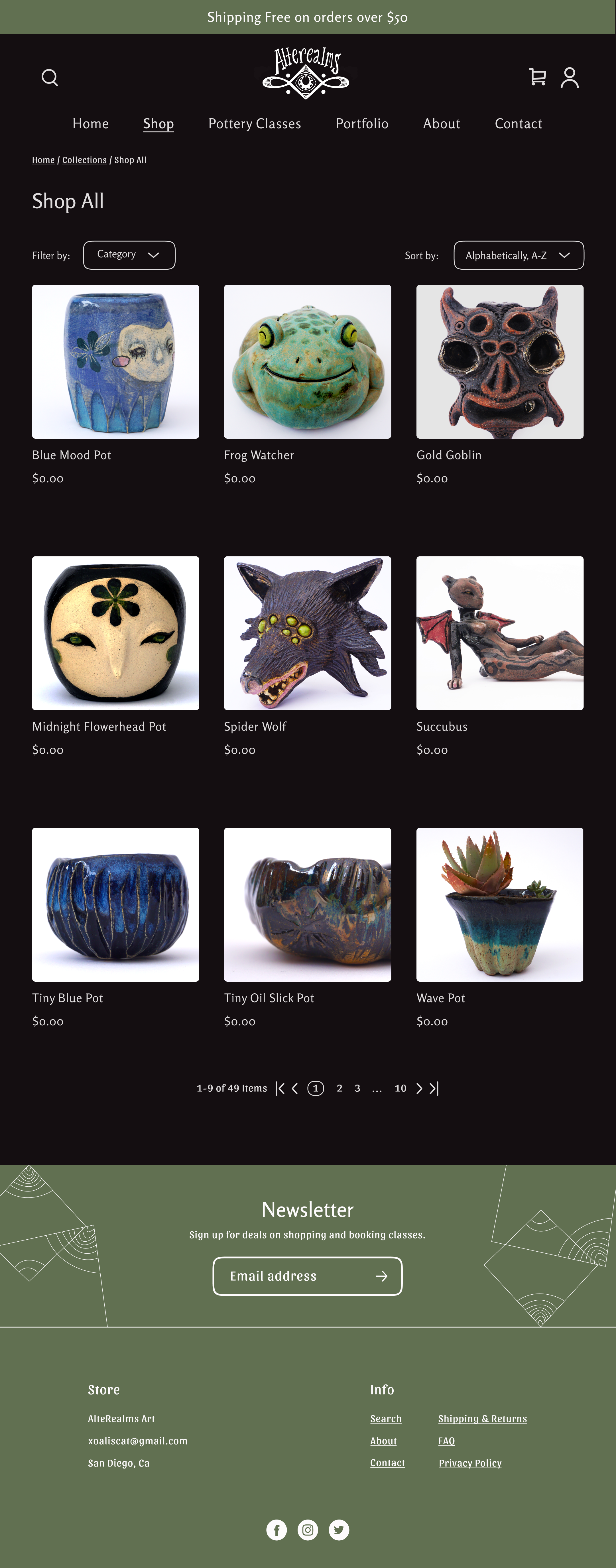
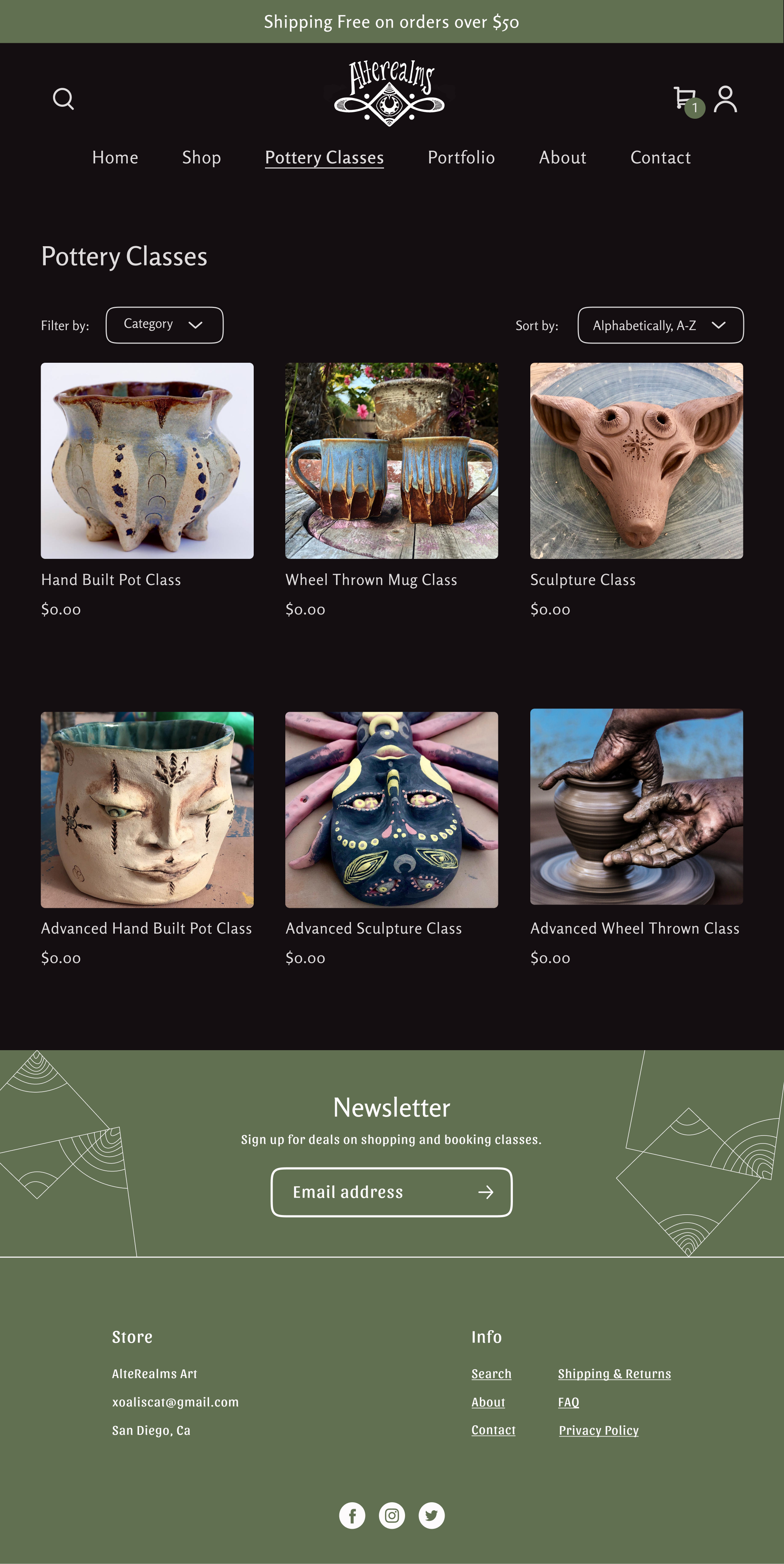
Visual Design
Putting everything together
With branding ironed out, I used Figma to create the visual design. There were a few things that I changed from my mid fidelity wireframes including:
1.
I replaced the custom section on the homepage with a portfolio section
2.
I decreased font sizes as I realized the body text was too big and overpowered the eye, especially with the dark background
3.
I added a dark film behind all of the screens with popup sections, so that those popups would be more visually eye catching and the pages would appear less busy
Visual Design
You can also swipe on mobile or click and swipe on desktop to view!


Responsive Visual Design


Test & Iterations
Test Objective
I created a prototype to test the product and see if there were any necessarily revisions needed. The main goals of the usability test were to see the overall impression of the visual design, understand the natural user flow, and identify any pain points in purchasing a product and booking a class.
Methodology
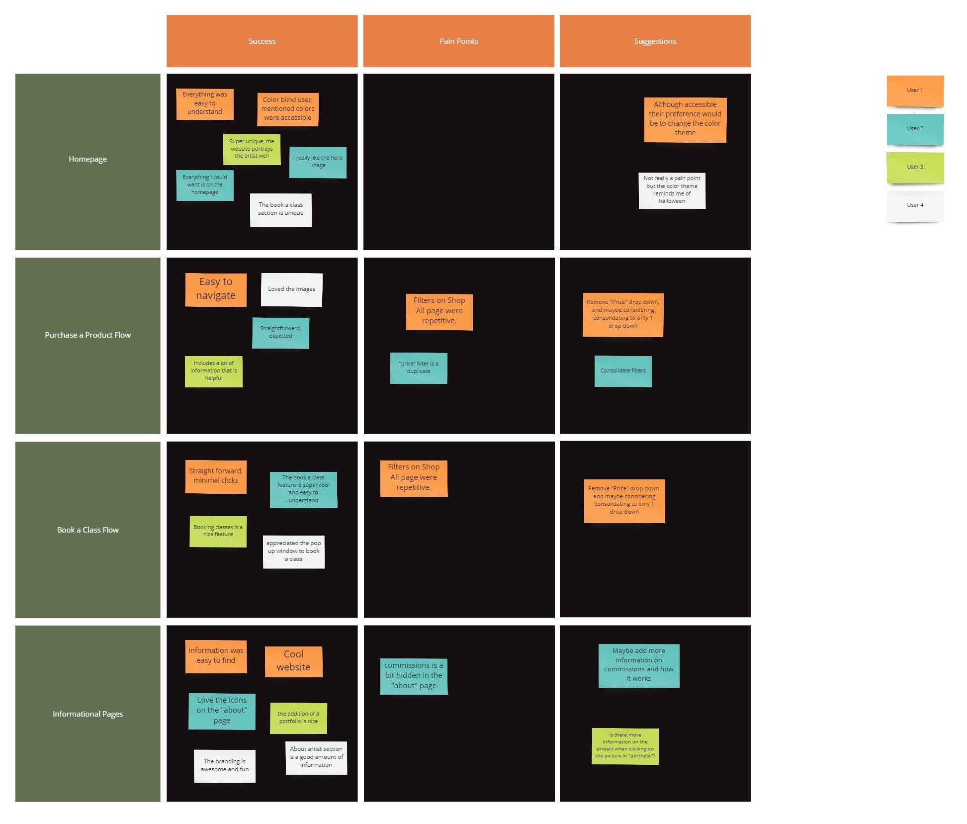
To test my prototype I conducted a usability test in-person and online using Maze with 4 participants. I preferred an in-person format because I felt that I received more information and could view the natural impressions of each participant.
I then used an affinity map to summarize my findings.
Insights
-
Overall users enjoyed the visual design and felt that the product imagery was very eye catching. The flows to purchase a product and book a class were straight forward and easy to understand. All participants successfully completed the tasks.
-
the majority of participants noticed that the “sort” and “filter” options included two separate sections to sort by price which added some confusion.
The commission section on the “about” page resulted in a few questions wondering how that process worked.
-
Overall the prototype was met with positive reviews. Some participants would prefer a lighter theme, but generally didn’t mind the dark background.
Product Revisions
Based on the feedback from testing here is what I focused on and revised:
I changed the filter for the “Shop All” and “Pottery Classes” pages, in order to simplify and remove the price repetitions.
I removed the commission section from the “About” page because that section would be better on its own page to better explain the process. Since I didn’t have enough information on how the artist wanted to format that, I chose to leave this page out for future revisions.
I wasn’t able to lighten up the color theme because the artist’s preference was to include a dark background, so instead I chose to add 87% opacity to the light text over dark background based on the dark theme Material Design suggestions, to decrease eye fatigue.
Otherwise, I didn’t make any other changes because all participants successfully completed each flow and enjoyed the visual design.


Reflection
Conclusion
Before-and-after user testing confirmed I was successful in designing an appealing and easy-to-use website for AlteRealm Art’s customers.
Learning
1. Involve stakeholders early and often
It helped to have weekly check-ins after all of these design phases to ensure that we were both on the same page and to course correct if not
2. Seek feedback
Working with the stakeholder’s preferred color palette took me outside of my comfort zone, so it helped getting feedback during the visual design process from my peers
Next Steps
If I had more time, I would collaborate with the artist to create a commissions page and add a flow on how to purchase a commissioned pottery item.
I would also add a flow to explore how the portfolio images can be viewed as well as how descriptions look on each of those images when clicked.
Since this is an independent artist, I’m planning to create this website on Shopify using the visual design template. In order to get some of the more custom elements like “book a class” I plan on using a plug-in integration I found.