

Zeit
A speculative project designing an e-commerce website for a fictitious time travel company.

-
My Role
End-to end UX/UI Designer and Researcher
-
Timeline
6 weeks at 20 hrs/week
-
Tools
Figma, Miro, OptimalSort, Whimsical
-
Prototype
Overview
For a class project, I designed a time travel booking website and developed branding for a fictitious time travel company.
Background
Imagine it is the year 2032, and time travel currently exists now.
The International Concordance on Time Travel just approved Zeit – the first to offer curated trips to the past exclusively. A subsidiary of Sir Richard Branson’s Virgin Media empire, that now offers the experience of time travel to the general public. With Zeit, travelers can now visit 289 approved destinations all over the world, from pre-historic times to today.
Zeit now needs a responsive e-commerce website to launch their new time travel services.
The Problem
How can an e-commerce website offering a brand new service inspire customer confidence and make it easy for customers to find and purchase time travel packages?
The Solution
Create an easy-to-use e-commerce responsive site for customers to explore and book all of the different time travel trips.
Design the logo for Zeit and develop a brand that will appeal to customers and feel familiar.
Research
Goals
Using the brief from Zeit, I defined my primary research objectives:
Learn the best way to introduce and explain time travel to people.
Know what travelers value and what their frustrations are when making travel/booking decisions.
Understand the best method to search and filter trips in order to build a website that feels familiar and is easy to use.
Competitor Analysis
I researched potential competitors to get a better understanding of the market and the travel booking processes. Once I understood the existing market, I began to hypothesize on what type of people would be interested in time travel.
Provisional Personas
I created 5 provisional personas to help understand and empathize before user interviews.
"The Adventurer" new experiences don’t always have to be good experiences.
"The F.O.M.O. Junkie" traveling with friends and people is a bonus.
"The Elite Socialite" accommodations and food are very important.
“The Traveling Historian” learning is very important.
“The Spirit Walker” experiences should be meaningful.
Research Findings
I identified several opportunities for Zeit:
No competitor offers time travel packages
Trip costs were often hidden until the checkout phase
Although Zeit is providing an entirely new offering, we could use similar UI elements and features to create trust
Reviews are included on 100% of the sites


User Interviews
I interviewed 4 participants all within the ages of 25-45 about their travel booking experiences. These participants either already had an interest in travel or were avid travelers. Questions were focused on learning about their behavior when planning and booking a trip, needs, wants, and hesitations about traveling to new places. I also focused on the pain points of travel and the booking experience.
Key Findings
-
The landing page and booking process needs to be eye catching, familiar and easy to use. Most participants chose booking companies based on popularity, friend/family recommendations, and word of mouth.
Since Zeit is a new company, we’ll need to focus on improving upon already existing user flows, building trust, and highlighting trip details/safety measures.
-
Participants reported they tend to dislike popups, advertisements that redirect to different sites, and misleading information or that is not easy to find.
-
When introduced to time travel all participants were open to the idea, but expressed that they would prefer to be guided by local guides in the respective time periods. They also would be willing to pay more to ensure safety during a new experience, while still seeking that feeling of a “good deal”.
Empathize
User Persona
Who are Zeit customers and what do they want when booking travel?
Meet “Bryan” the adventurer-
Based on insights from secondary research and user interviews, I created a user persona that served as a reference for making user-centered decisions throughout the design process.
Bryan is a Software Engineer working in California that works hard and plays even harder. He is always seeking the ultimate experience, but does appreciate a knowledgeable guide and feeling safe. His main goal is to stretch his comfort zone and learn about himself through new experiences.

Designing with a fresh perspective
With the user persona and research findings completed, I reviewed the project goals to find the sweet spot of where business and user goals overlap.
Feature Roadmap
I created a feature roadmap to summarize what needed to be included on the site and based them on priority for the user as well as for Zeit.
My primary goals for creating and organizing features:
Offer expected features that users already see and appreciate on similar travel sites
Make safety information and reviews accessible
Surprise and delight
Card Sort
I wanted to know how users would navigate through the site to browse the available trips and eventually book. To do this I used OptimalSort to create a Hybrid Card Sort. Participants sorted cards into pre-determined trip categories and were also able to create their own category names as well. They did not know which destinations were designed to be in each category.
There were 32 cards and a total of 5 trip categories; Art & Music, Historical Events, The Evolution of Sports, and Defining Cultural Events.
I had a total of 5 participants.
They all created 4-5 categories and popular categories were; Sports, Music & Arts, History, Culture, Events, and Architecture.
Define
Site Map
After empathizing with my target user, I created a site map to label the navigation and layout to identify the overall structure of the website. The card sort specifically helped in the “Trips by Category” section of the site.

Task Flow
I created a task flow based on user action of booking a trip. This particular flow was focused on the booking process from the start of “Trips by Category”.
This helped me to confirm the sitemap was accurate and ensure users can efficiently complete the primary task of booking a trip.
User Flow
To further understand the path a user takes, I created a user flow and made sure to include the possible paths -including errors- a user would take within the process of booking a trip.
I reflected on possible site entrance and exit points and the relationships between pages.


Ideate
Lo Fi Sketches
Based on what was accomplished in the Empathize and Define phases I started off with some lo fi sketches to brainstorm the homepage and other screens. I was now ready to brainstorm and sketch layout options to see which ones worked best.
Wireframes
After collecting feedback from Design Lab peers on the sketches, I created some hi fidelity wireframes in order to best portray the design elements and structure of the site.
Step 1: I created hi fidelity wireframes for desktop
Step 2: From there I created responsive wireframes for the homepage that were mobile and tablet
Step 3: Once I was clear on the homepage, I then finished the responsive wireframes for mobile
Hi Fidelity Wireframes
You can also swipe on mobile or click and swipe on desktop to view!


Hi Fidelity Responsive Wireframes


Hi Fidelity Mobile Wireframes


Branding
Now it was time for some branding and UI Design.
I was inspired by nature/images of nature in creating the color palette.
I created the logo with a minimalist take on an hour glass outlined by the earth— as a homage to time travel.
I developed a style Guide, UI Kit, and mood board to further establish the brand identity.


Visual Design
Putting everything together
With branding ironed out, I used Figma to implement the text, color, and images into my Hi Fidelity Wireframes.
I then linked all of the screens and components with my user flow in mind to create the Prototype.
I chose to do a high fidelity prototype because I wanted to get more feedback on the UI and a more realistic idea of how users would interact with the design.
Visual Design Desktop
You can also swipe on mobile or click and swipe on desktop to view!


Visual Design Mobile
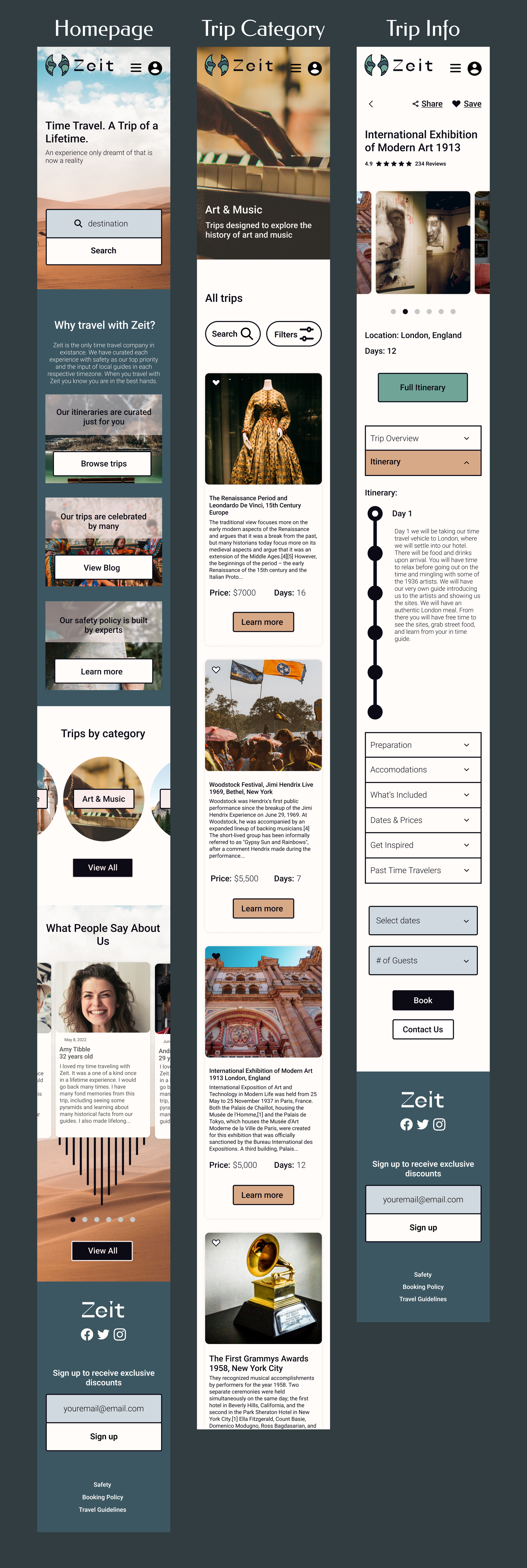

Notable Features
1.
Itinerary drop down to easily move through the day-to-day plans of the trip. This provides accessible information.
2.
"Why travel with Zeit?" Menu available on the homepage to review itinerary, blog, and safety procedures.
3.
Accessible reviews available from past travelers, including photos and ratings.
Test & Iterate
Test Objective
I created a prototype to test the product, validate my findings, and shine a light on any necessary revisions. The main goals of the usability test was to test the general impression, understand the natural user flow, and identify any pain points in completing the task.
Methodology
To test my prototype I conducted a usability test in-person with 4 participants using Figma to ensure I could observe affectively.
I used an affinity map to summarize my findings.
Insights
-
Overall users felt that the site was easy to navigate, visually appealing, the reviews were a nice touch, and the check out process was fast.
-
One user felt that “Browse Trips” in the navigation would be better than “Book a Trip”. There were also some minor formatting issues that could be improved upon. The participants also expressed interest in seeing the other pages, or searching for trips with the search bar instead of “Trips by Category”.
-
Overall the participants agreed that including a map and adding a photo/more photos in the booking process would improve the design. To gain more trust, some users expressed interests in seeing more quotes from previous customers and wanting to see more completed pages on the safety accommodations.

Product Revisions
Based on the feedback from testing here is what I focused on and revised:
I changed the top half of the homepage to be a little less chaotic and visually flow better. This included aligning the call to action in the middle and removing the photo gallery in the “Why travel with Zeit?” section
I added a map on the trip information page to correlate with day 1 of the trip.
I chose to add a photo on the summary page as that was consistently mentioned by users and it livened the ending of the booking flow up.
Otherwise, I didn't make any drastic changes, as the feedback was generally positive except for some formatting issues. I fixed those, including some input sizes, font sizes, alignment, etc.


Reflection
Conclusion
User testing affirmed I was successful in designing an appealing and easy-to-use e-commerce website for Zeit. Users were able to complete booking a trip. Most importantly, 100% of users said the quality and content of the Zeit website increased their confidence in time travel.
Learning
As my first end-to-end UX project, this was a hands on way to learn about UX research and design methods. Since this was a hypothetical prompt based on time travel -which doesn’t exist- it did feel awkward at times during the research and design phases.
Next Steps
I’d ensure the design handoff to the developer and engineer teams run smoothy, and to add any necessary design instructions.
If I had more time I would have created a user flow for what the safety pages looked like, since this would have increased customer confidence and trust.
I would also go back and conduct another usability test with more participants to see whether the suggestions were consistent, and uncover any patterns. With that in mind, since I only had 4 participants it was difficult to make any further changes to the prototype.